.jpg)
We’ve redesigned the Weel navigation to make it cleaner, faster, and easier to find what you need. The new menu is now collapsed by default, expanding on hover to give you more space while keeping navigation effortless.
The top section focuses on Payments — including Cards, Subscriptions, Accounts Payable, and Reimbursements — everything you need to manage company spending day to day.
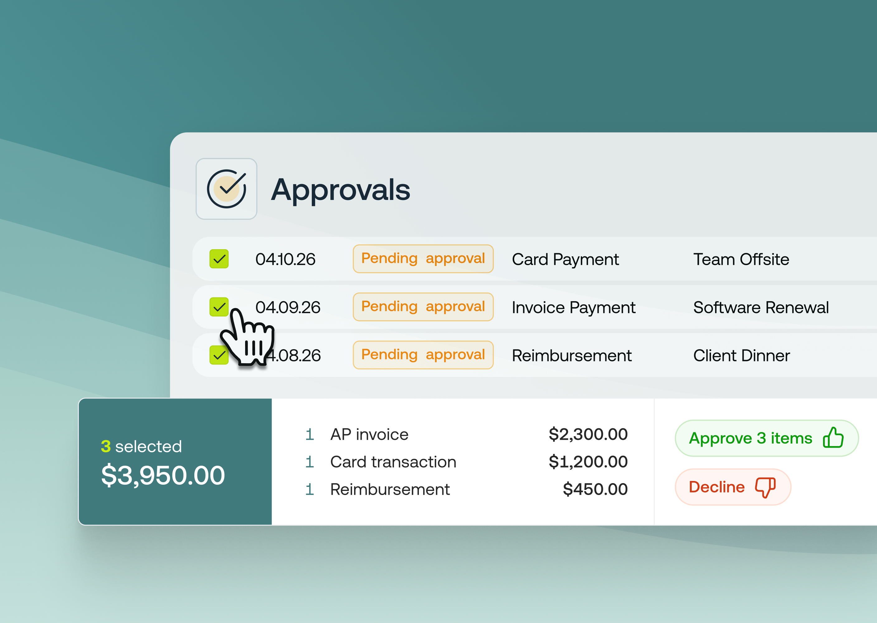
Below the divider, you’ll find Spend Management, with Budgets, Transactions, Approvals, Approval Rules, Reports, and Suppliers — giving finance teams clear visibility and control.
Across the top header, you can now quickly check your account balance, invite users, view notifications, and access user management and account settings.
If you manage multiple businesses, simply click your business name to switch accounts or log out.
With this new design, navigating the Weel platform is now simpler, clearer, and faster.
This update is currently rolling out to customers, so you may see it appear in your account soon.
You don’t need to do anything — the new navigation will automatically appear in your account once it’s rolled out to you.
Hover over the sidebar to explore the new sections and enjoy a faster, more focused experience.